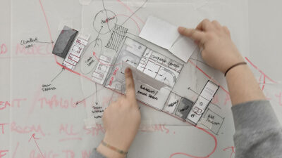

Architectural students often face significant challenges in applying appropriate line weights and types in their drawings. Misuse of these conventions leads to misunderstandings, as viewers struggle to interpret the drawings accurately. Consequently, the clarity and communication of the architect’s ideas are compromised, hindering a proper understanding of their work.
The Language of Architectural Drawings
Architectural drawings, unique in their communicative ability, harness a blend of lines, text, symbols, hatching, and color to vividly present the essence of a structure. This intricate language, crafted through these elements, serves to translate complex architectural ideas into a visual format that can be universally understood. The careful selection and application of these elements ensure that every nuance of the design is effectively communicated.
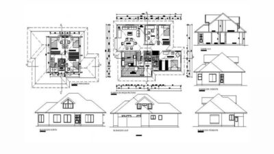
Throughout the architectural design process, a diverse array of drawings is employed, each tailored to illustrate specific aspects of the project. Be it floor plans, elevations, sections, or detailed drawings, the consistency in the use of line types and weights is pivotal. This uniformity ensures coherence and clarity across all forms of technical documentation, creating a common visual language that is easily interpretable by architects, draftspersons, engineers, and industrial designers alike. This shared language allows for seamless collaboration and understanding across various disciplines, reinforcing the role of architectural drawings as a fundamental tool in the conception and realization of architectural designs.
Deciphering Line Types and Weights
Line type and weight are integral components of architectural drawings, serving as the visual language that conveys depth, structure, and perspective. The line type, whether dotted, dashed, or solid, represents various physical and conceptual aspects of the design. Dotted lines might indicate hidden structures beneath the surface, dashed lines could represent boundaries or elements not directly visible, and solid lines depict the tangible, visible parts of the structure. This differentiation helps in creating a multi-dimensional understanding of the architectural space, providing insights into both its visible façade and its concealed components.
Line weight adds another layer of complexity and meaning. Thicker lines often signify structural importance or the foreground in a design, drawing the viewer’s attention to key elements of the architecture. Conversely, thinner lines might be used for background details, secondary elements, or to indicate textures and materials. The interplay between different line weights creates a hierarchy within the drawing, guiding the viewer’s eye and understanding through the architectural plan or elevation.
In the digital realm, where CAD programs offer a spectrum of colors for line representation, the significance of line type and weight becomes even more pronounced when translated into the final black, white, and grey prints. The absence of color in final prints elevates the role of line type and weight, making them the primary tools for differentiation and communication. This constraint challenges architects to rely on the nuances of line styles and thicknesses to convey their ideas effectively, ensuring that the final printed drawings are not only clear and legible but also rich in information and architectural intent. Hence, the thoughtful application of line type and weight is not merely a technical skill but a critical aspect of architectural storytelling.
Architectural Line Types
Each line in an architectural drawing is more than a mere mark on paper; it’s a symbolic representation that conveys specific information about the design. Solid lines, for instance, are straightforward in their purpose, delineating elements that are visible and tangible in the real world. These lines define the outer boundaries of structures, the edges of walls, and the contours of architectural forms, making them fundamental to the viewer’s understanding of the physical aspects of the design.
Dashed lines, on the other hand, play a subtly complex role. They represent elements that exist but are not immediately visible in the given perspective. This could include underlying structures, hidden supports, or interior elements obscured by external walls. The use of dashed lines invites viewers to look beyond the surface, to consider what lies hidden within the design, thus enriching their understanding of the complete architectural concept.
Furthermore, the long dash-short dash lines hold a unique place in architectural drawings. These lines don’t represent physical structures but are crucial for understanding the spatial relationships within the design. They might indicate boundaries, setback lines, or other abstract yet essential elements in space planning. By mapping out non-physical points, these lines help architects and viewers alike to conceptualize the volume and distribution of space within the design. They provide a framework within which the physical elements are organized, offering insights into the architect’s vision of how the space is perceived and experienced.
Each line type in an architectural drawing is a critical tool for communication. Solid lines bring clarity to the visible aspects, dashed lines reveal the hidden layers, and long dash-short dash lines provide a context for understanding the spatial dynamics of the design. Together, they create a comprehensive visual language that conveys the full depth and complexity of architectural ideas.
Essential Architecture Design Drawing Conventions
When deciding on line types, architects consider the visibility and relevance of elements in real life, using solid lines for visible elements and dashed lines for significant hidden elements. Non-existing reference points are depicted with setback, boundary, or grid lines.
Other Line Types
Architects should be familiar with a variety of line types, as drawings from other disciplines may employ different conventions. It’s crucial to refer to keys or legends to understand these variations.
Architectural Line Weights
Line weights in architectural drawings are a vital aspect of visual communication, where the thickness of each line carries specific meanings and conveys varying levels of importance within the design. In architecture, the deliberate variation of line weights is not merely a stylistic choice but a strategic tool to distinguish different elements and layers of a structure. Thicker lines are typically employed to indicate primary structural elements or aspects of the design that are closest to the viewer. These bold lines draw attention, emphasizing the fundamental components of the architectural form.
Conversely, thinner lines are used to portray less dominant elements, such as interior details, textures, or background features. These subtle lines provide necessary detail without overwhelming the primary focus of the drawing. The gradation of line weights from thick to thin also creates a sense of depth and hierarchy, making the drawing more legible and easier to interpret.
Historically, the reliance on a limited range of pen thicknesses was not only a matter of practicality but also a reflection of the discipline inherent in architectural drawing. This practice, which predates the widespread use of CAD software, instilled a sense of discipline and thoughtfulness in the representation of architectural ideas. Even with the technological advancements in digital drawing tools, the principles governing line weights remain largely unchanged. The simplicity of using a few select line weights continues to be effective in conveying the complexity of architectural designs.
In essence, the use of line weights in architecture is a blend of art and technique, where each variation in thickness plays a specific role in the overall narrative of the drawing. It’s a testament to the enduring principles of architectural representation, where clarity, precision, and attention to detail are as important today as they were in the era of pen and paper.
Utilizing Architectural Line Weights
In architectural drawings, line weights vary from thickest to thinnest, depending on the element and its significance. For example, the thickest lines are used for section cuts, while the thinnest might denote material details.
Moving Forward
Architects are encouraged to study and save effective drawings, developing a personal library of styles. Understanding and applying line types and weights becomes intuitive with practice, leading to clearer and more effective architectural representations.
Conclusion: Mastering the Art of Architectural Drawings
In conclusion, the mastery of line types and weights in architectural drawings is not just a technical requirement, but a fundamental skill that bridges the gap between abstract ideas and tangible structures. Architects, by meticulously selecting the appropriate line types and weights, craft a visual language that speaks volumes about their design intent. This careful consideration of visual elements ensures that the final presentation is not only aesthetically pleasing but also informative and precise.
As budding architects delve into the realm of architectural drawings, they embark on a journey of learning and refinement. It’s a process that demands attention to detail, an understanding of spatial relationships, and an appreciation for the nuances of visual communication. The journey from sketch to structure is paved with decisions about how best to represent elements, both seen and unseen, and how to convey the depth and texture of a space through the simple, yet powerful, language of lines.
Moreover, the evolution of technology in architectural design, from hand-drawn sketches to sophisticated CAD software, has expanded the possibilities of what can be conveyed through drawings. Yet, the fundamental principles of line use remain unchanged. The choice of line type and weight still plays a crucial role in differentiating between foreground and background, solid and void, material and immaterial. These choices are not just artistic; they are deeply technical and profoundly impact the viewer’s understanding and interpretation of the design.
In essence, the proper use of line types and weights is a skill that architects refine over time, through observation, practice, and a deep understanding of their craft. It’s a skill that transforms drawings from mere representations to powerful tools of communication, capable of bringing an architect’s vision to life. By mastering this art, architects ensure that their ideas are not lost in translation, but are instead clearly and effectively communicated, paving the way for their physical realization.